Tourism Australia
We were given the challenge of creating a new logo for the face of Australian tourism, and one that worked as a visual expression of Tourism Australia’s new campaign idea, “there’s nothing like Australia”. As a country with vast coastlines, tropical rainforests, modern cities, and unique flora and fauna, the client was looking a contemporary expression of Australia that showcased the diversity of this beautiful country.
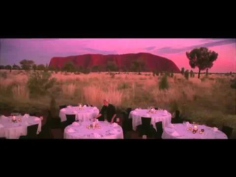
Research highlighted that people saw Australia as a wonderfully colourful experience - but the old logo, through colour, referenced only one Australian experience: the outback. As there is nothing like the kangaroo, we decided to redraw its shape, poise and movement, but with new energy and vitality. And we introduced new colours to express the breadth of experiences down under, and introduced new typography, for fresh appeal. We now have a positive expression of Australia’s brand, transcending countries, cultures and languages, while retaining the energy and symbolism of the kangaroo.
Created with Chris Doyle and Joao Peres at Interbrand Australia


